How to Build a High-Converting Systeme.io Landing Page in 15 Minutes (Beginner Guide)
If you’ve ever stared at a blank landing page and felt that quiet wave of overwhelm, you’re not alone. Most beginners think they need perfect design skills, some hidden marketing formula, or hours of tinkering to build a page that actually converts. Systeme.io flips that idea on its head.
This platform works beautifully for beginners because it’s intentionally simple. The editor guides you toward cleaner layouts, faster decisions, and fewer dead ends. And when you remove the clutter and second-guessing, something interesting happens: conversions go up. Visitors take action more quickly because they aren’t drowning in distractions.
Systeme.io’s structure naturally keeps you focused on what matters—your message, your offer, and the small handful of elements that turn a curious visitor into a new lead. This guide walks you through the exact process to create a polished, conversion-ready landing page in about fifteen minutes… even if you’ve never built one before.
Choosing the Right Systeme.io Template for Your Goal
Your landing page’s success starts with one simple choice: picking the right template. Beginners often scroll endlessly, trying to find “the perfect one,” but the truth is far less stressful. You just need a template that matches the goal of your page—nothing more.
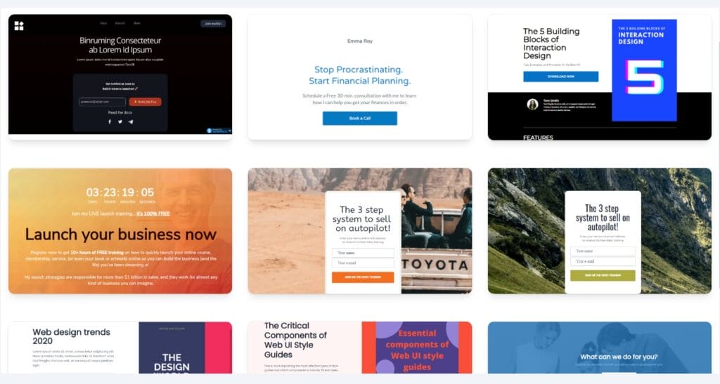
Here’s the simplest way to think about it:
- If you want email subscribers → choose a lead generation template.
- If you want sales → choose a sales page template.
- If you’re building hype → choose a waitlist or coming soon template.
You’re looking for clarity, not complexity. The best beginner templates have:
- A strong hero section
- One clear call to action
- A straightforward layout
- Minimal extra sections
What you don’t want is a template with a dozen sections, multiple CTA paths, or heavy design elements you’ll need an hour to figure out. Keep it simple. Simple converts.
Understanding the Systeme.io Editor (And Which Blocks Actually Matter)
The editor inside Systeme.io is easy to get comfortable with, but beginners often click into every block and wonder what’s safe to touch. Here’s the truth: only a few elements shape the entire conversion experience.
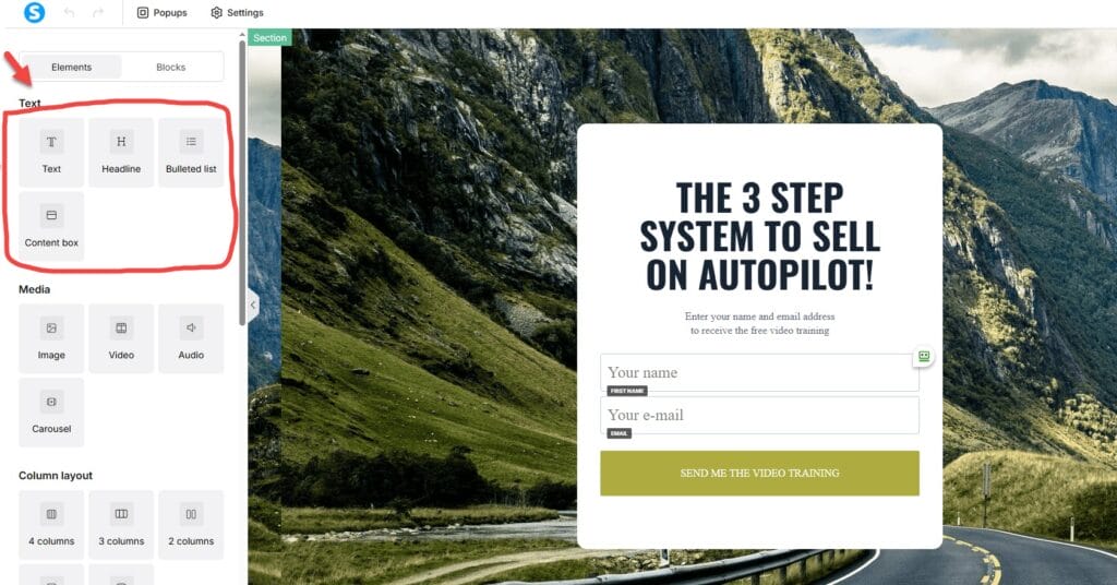
The essential blocks you’ll rely on
- Headline – This tells your visitor why they should care.
- Text – This expands on the benefit in a clear, human way.
- Image – Should reinforce your offer, not distract from it.
- Button – Your primary action driver.
- Form – The moment where the visitor becomes a lead.
Everything else is optional seasoning—not the meal.
Blocks to treat with caution
- Carousels
- Background video sections
- Busy multi-column layouts
- Large spacer blocks
These tend to make pages feel noisier and break more easily on mobile, which is where most of your visitors will land.
Building Your First High-Converting Systeme.io Landing Page (Step-by-Step)
Let’s walk through the process as if you and I were building the page together—no fluff, just the pieces that matter.
Step 1: Write a Headline That Gives Visitors a Reason to Stay
Your headline is the hinge the entire page swings on. Think of it as a promise. Clear, specific, and rooted in the transformation you’re offering.
You don’t need poetry. You need clarity.
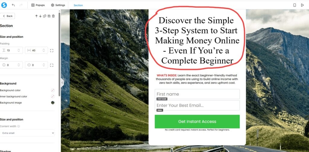
Examples that work beautifully:
- “Get the Free Checklist That Helps You Launch Your Online Business in 7 Days”
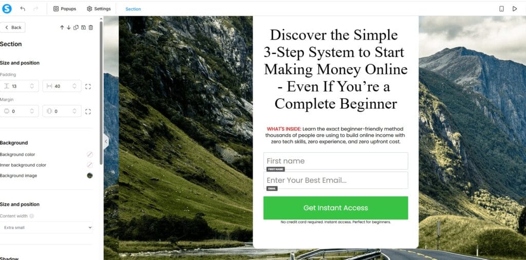
- “Discover the Simple 3-Step System to Start Making Money Online — Even If You’re a Complete Beginner”
- “Download the Beginner Funnel Blueprint That Makes Setup Simple”
- “Join the Challenge That Kickstarts Your Affiliate Journey Today”
Visitors don’t respond to features. They respond to outcomes.
Step 2: Build a Clean, Easy-to-Scan Layout
Above the fold, aim for:
- A headline
- A short, supportive subhead
- A button or form
- A simple visual
Everything below the fold should feel like a gentle nudge, not a lecture. Resist the urge to add too many sections. Beginners convert best with less, not more.
Step 3: Use the Right Visual
Your image should help visitors imagine what they’re about to receive. Pick visuals that feel like a real extension of your offer, not random decoration.
The best choices include:
- Ebook or checklist mockups
- Course or video thumbnails
- A clean, friendly photo
- Device mockups with previews
Avoid glossy stock images—they don’t build trust, they dilute it.
Step 4: Keep Your Form Short
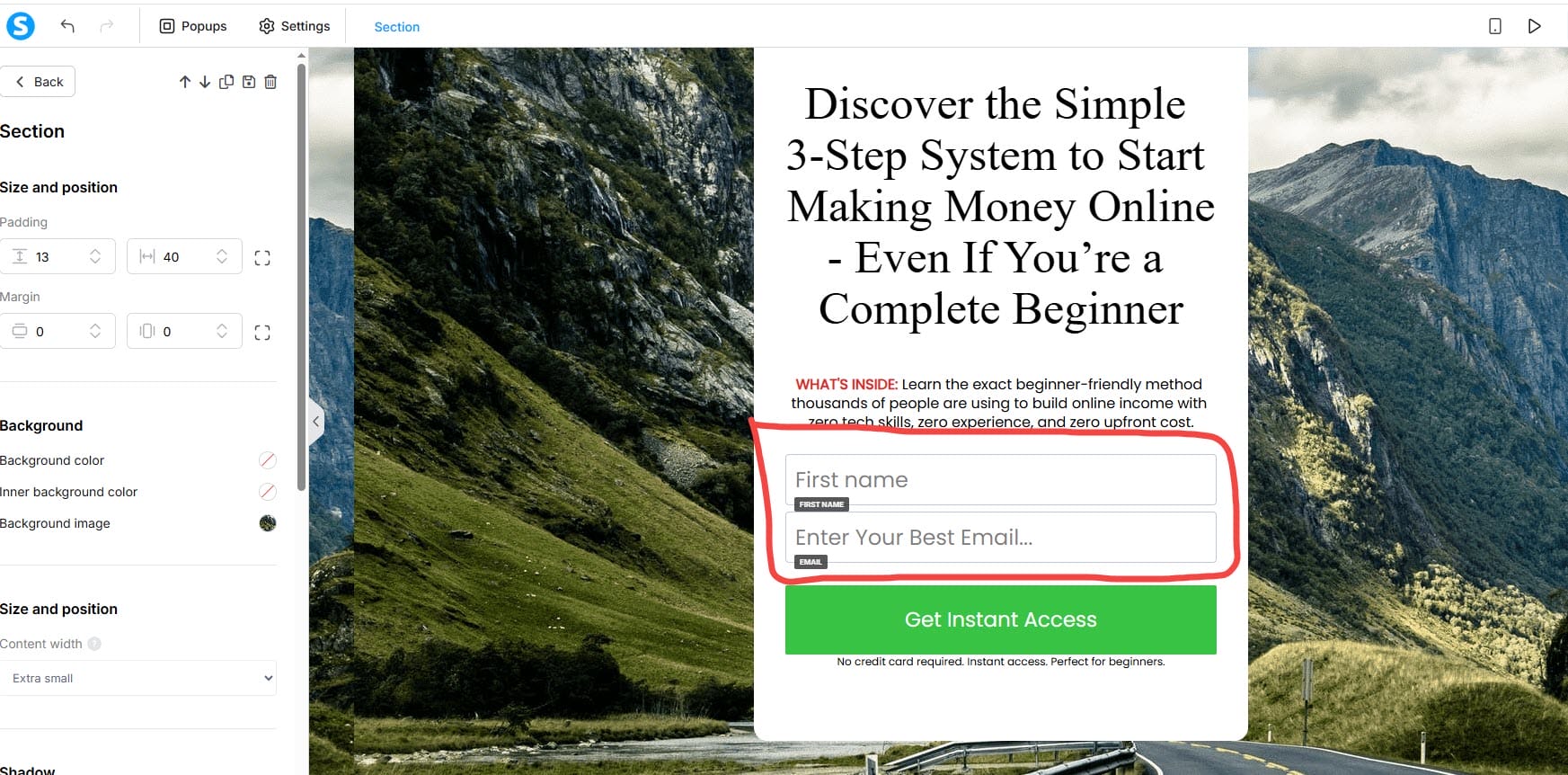
If your goal is lead generation, don’t complicate the form. Every extra field creates a moment of hesitation.
Required:
Optional:
- First name
That’s it. Simplicity wins.
Step 5: Add Micro-Copy That Helps Visitors Take the Leap
Short reassurance phrases make an outsized impact because they address the tiny worries people rarely say out loud.
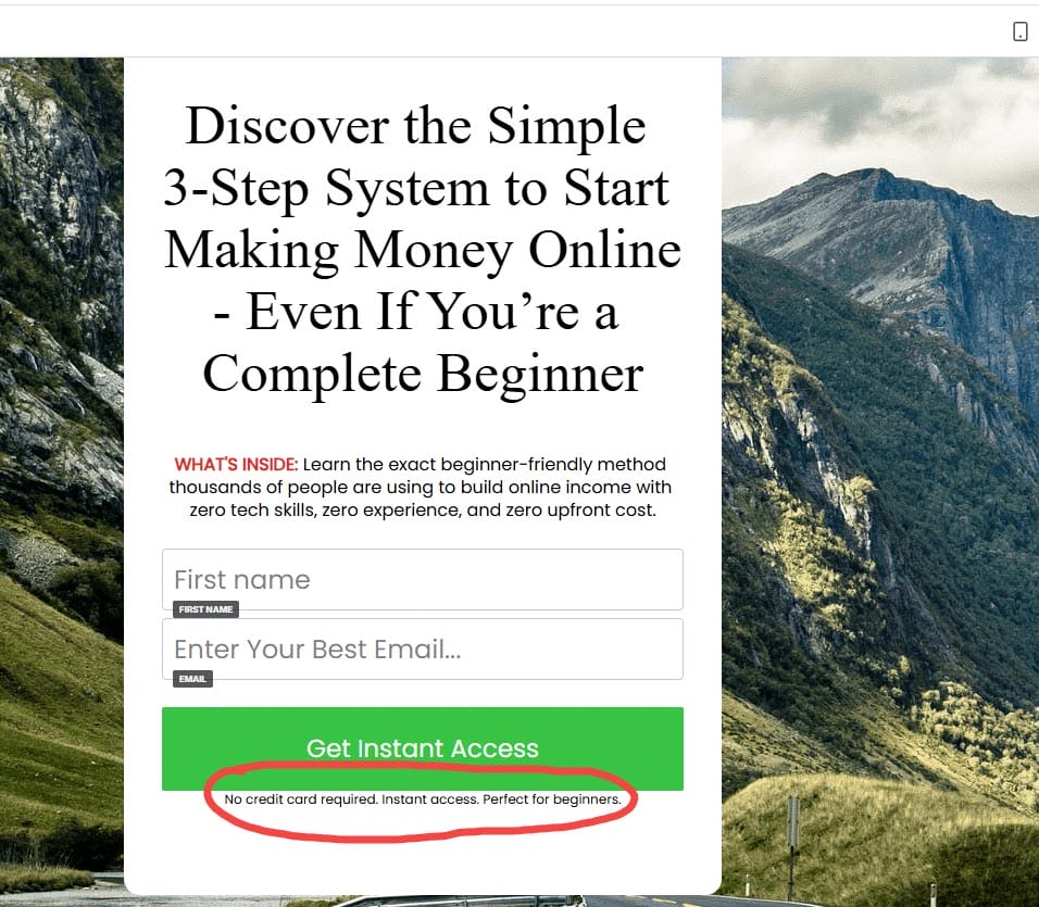
Add small notes like:
- “You can unsubscribe anytime.”
- “No credit card required. Instant access. Perfect for beginners.“
- “No spam—ever.”
- “Instant access inside your inbox.”
This kind of language softens the friction and makes the action feel safe.
Step 6: Use a CTA That Sounds Like the Visitor’s Voice
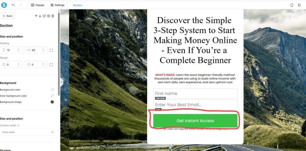
“Submit” is robotic. “Get Instant Access” feels like a step forward.
A few reliable go-tos:
- “Send Me the Guide”
- “Get Instant Access”
- “I Want This!”
- “Show Me How to Start”
First-person CTAs consistently outperform generic ones because they reinforce the user’s sense of agency.
Easy Systeme.io Enhancements That Make a Big Difference
Use Timers With Intention
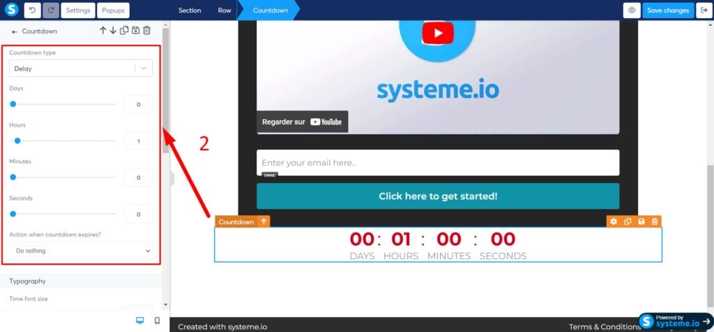
A timer can strengthen urgency, but only when the deadline is real. If you use one on a normal, evergreen freebie, it backfires.
Good uses:
- Challenge registration closing
- Limited-time bonuses
- Real launch windows
Bad uses:
- Everyday lead magnets
- Evergreen offers
- Anything fake or forced
Visitors feel the difference instantly.
Add a Short Video to Build Trust
If you’re comfortable turning on the camera, a 30–60 second video can transform how people react to your page. You don’t need high production—just a real explanation of who the page is for and why the offer is worth their time.
Authenticity beats polish. Always.
Make Sure Your Page Passes the Mobile Test
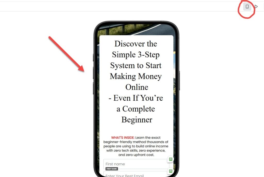
Grab your phone and load the page. You’re looking for:
- Clean spacing
- Easy-to-read headline
- Buttons big enough for thumbs
- A form that isn’t squeezed
- A page that doesn’t feel overwhelming
If a visitor can understand your offer within the first five seconds on mobile, you’re in excellent shape.
Copywriting Tips Tailored Specifically to Systeme.io’s Structure
Benefit Stacking
Paint a picture of what changes after they opt in.
Not:
“Download my email marketing guide.”
Better:
“Learn the 5-step email system beginners use to double their affiliate income.”
Build a Hero Section That Tells a Story Quickly
The strongest hero sections follow a simple rhythm:
- What they want
- Why it matters
- What they get
- How to get it
It’s a subtle narrative arc, but visitors feel it instantly.
Use CTA Scripts That Spark Action
Try action-based, first-person language like:
- “Give Me Instant Access”
- “Let’s Start This”
- “Send It to My Inbox”
These create a sense of momentum and commitment.
Beginner FAQs for Systeme.io Landing Pages
How long should my landing page be?
Short. Most top-performing beginner pages have two to four small sections.
Can I use more than one CTA?
One CTA, repeated. Not multiple choices.
Should I link to other pages?
Avoid it. Every extra link leaks conversions.
Do I need long copy?
Not for lead magnets. Short, benefit-driven copy wins.
Does design matter?
Yes, but clarity always beats aesthetics.
Products / Tools / Resources
- Systeme.io – Your all-in-one platform for funnels, email marketing, automation, and landing pages.
- Canva – Perfect for creating ebook mockups, thumbnails, and simple visuals for your landing pages.
- Unsplash & Pexels – Free, high-quality images when you need clean and minimal visuals.
- Squoosh.app – Compress your images before uploading to keep pages fast on mobile.
- Notion or Google Docs – Great for writing and storing your page copy before you paste it into Systeme.io.

